Now that I’ve described in Part I how DRA enables assessing a map’s competitiveness, along with other dimensions, I’ll lay out how DRA makes it possible to compare different maps. To do that, I’ll compare the preliminary map for the new districts that CO’s independent redistricting commission has released to the legislatively enacted plan in place from 2011-2020.
Two points at the outset. CO has gained 1 seat and will have 8 congressional districts, but we can still compare the aggregate effects of the 2020 map and the proposed map for 2022. Second, I am using the map titled CO preliminary 2021 Congressional Districts, under Published Maps, in DRA. This is the commission’s proposed map, and since the 2020 Census numbers have not been released, the census and demographic numbers are based on the 2019 ACS data.
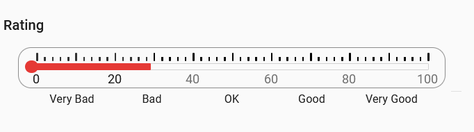
Recall that Amendment Y requires the commission to give significant weight to the value of competitive districts. Recall also that the legislatively-enacted plan, in effect in 2020, came out as “very bad” on competitiveness ground. The commission does improve on this metric, since the proposed plan would merely be “bad” on competitiveness grounds. Here’s the thermometer to illustrate where the new plan comes out on competitiveness.
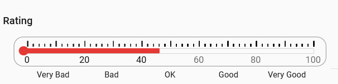
The proposed plan is also a tad better, though not much, on compactness:
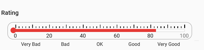
The new plan fares less well on proportionality of the outcomes in partisan terms. That’s because the commission proposed plan is a bit more favorable to Democrats than a fully proportional plan. With 8 seats, the most proportional plan, given voter preferences in CO, would have 4 districts likely to come out for the Democrats and 4 districts for Republicans. Statistically, the proposed plan projects 4.64 districts to be controlled by Democrats. That is, the odds of a 5-3 D-R split are higher than they would be in a purely proportional plan.
Proportionality:
DRA has a great feature that permits two plans to be directly compared and presents the comparison in visual terms. Recall the “radar graph” for the plan in effect. Using a Compare Maps feature, DRA superimposes this graph for one map on top of the other. The result looks like this, when we compare the 2020 plan with the commission proposed plan:
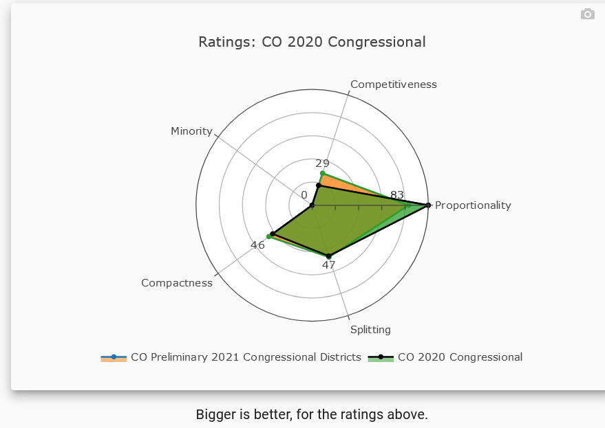
From this direct comparison, in which the orange lines represent the commission proposal and the black lines the 2020 map, we can see the following: the commission proposal creates somewhat more competitive districts; is the same on county splits; is a tad better on compactness, and, for the reasons just noted, would be likely to produced slightly less proportional outcomes. The commission process would thus be something of a gain for competitiveness, but not a dramatic one.
But now here is something else that can be done – DRA enables individuals and groups to draw their own maps, and DRA identifies the map that would maximize the competitiveness of districts. I’ll save another post for what that map suggests about how much more competitive Colorado’s commission might be able to make the districts, and what tradeoffs would be involved in doing so.