Colorado’s congressional districts are being drawn by an independent redistricting commission created in 2018 by “Amendment Y,” a legislatively referred constitutional amendment that voters approved. That amendment also specifies the criteria the commission is to use. After specifying that districts must comply with constitutional requirements for population equality and the VRA, the amendment states:
(2) (a) as much as is reasonably possible, the commission’s plan must preserve whole communities of interest and whole political subdivisions, such as counties, cities, and towns.
(b) districts must be as compact as is reasonably possible.
(3) (a) thereafter, the commission shall, to the extent possible, maximize the number of politically competitive districts [emphasis added]
This provides a good opportunity to begin to discuss how to assess the competitiveness of maps. As I have argued, the competiveness of maps ought to be a high value in drawing maps, though incumbents prefer the exact opposite. I’ll explain how the free app, Dave’s Redistricting (DRA), can be used to assess the competitiveness of proposed and enacted plans.
First, start with the map currently in effect, in which CO has 7 congressional districts. If you click on the “Show Analytics” tab for that map, DRA provides quantitative metrics for how any map fares on 5 dimensions: (1) compactness of districts; (2) competitiveness of districts; (3) minority representation opportunities; (4) how much the map splits counties between districts; (5) the “proportionality” of the map, which means the likely D v. R outcomes under the map given the past preferences of voters across a series of elections [a dozen measures of partisan bias experts use are also available]. This also enables map drawers to see the tradeoffs involved between these values. If you decide the overriding goal should to be ensure proportional outcomes, for example, how much sacrifice must be made in other values, like keeping counties intact or having competitive districts.
DRA provides visual and quantitative data on these dimensions. But it then also helpfully converts that more technical data into an easily understood and visualized thermometer graph to explain what those numbers mean in lay terms.
I’ll illustrate with two shots taken from DRA. In the first, the higher the value, the better the map scores on that particular measure. First, here’s the technical graphic for the current map:
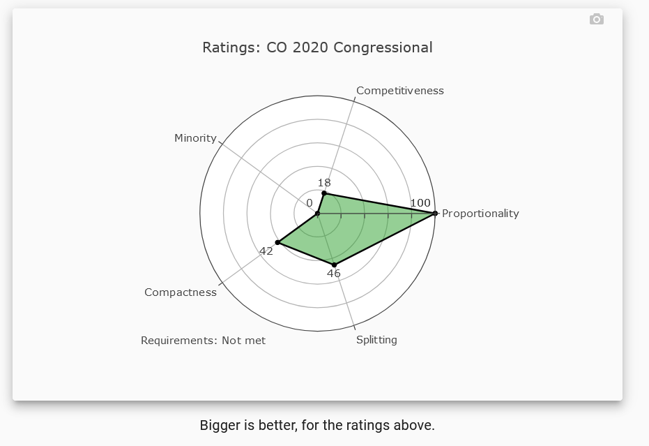
This shows that the map performs extremely well on fairness of partisan outcomes, but poorly on competitiveness. It also performs poorly on minority representation, as DRA defines that, because it has no districts that are majority-minority (DRA uses 2019 ACS data and reports CO as having a Hispanic population of around 15-16% and a black population a bit above 4%).
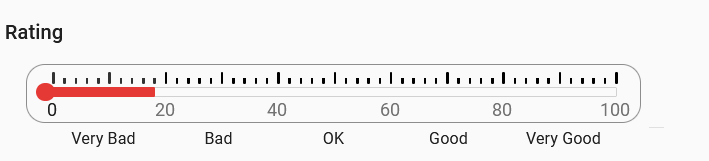
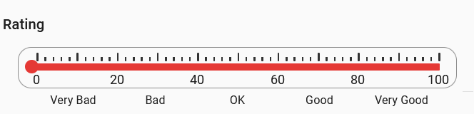
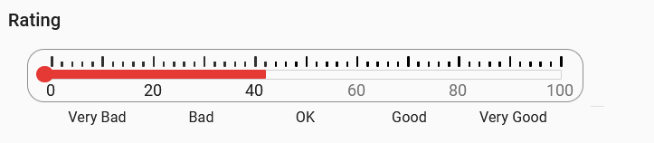
Here’s the second graphic, which puts these technical measures into easily understood terms.
On competitiveness, the current map is “very bad”–
On proportionality, or partisan outcomes, the current map is “very good” –
On compactness the current map sits on the border between “bad” and “okay” —
With that in mind, one of the great virtues of DRA is that it enables users to compare maps along all these dimensions. That’s particularly interesting in CO, given that Amendment Y requires the commission to “maximize” competitive districts, subject to a few other constraints.
In addition, the commission recently released its initial proposed map. We can compare that map to the one currently in effect – as well as to maps that others have drawn for the new districts, to see how well the commission has met its legal obligations.
Since this post is already a long one, I will leave for another post how to do those comparisons and, more importantly, what they tell us about the commission’s initial proposed map and alternatives.