My last post yesterday highlighted the patience NYC voters might need, but it looks like the verdict was pretty clear even in the first round of results, and will likely get clearer as the count rolls on.
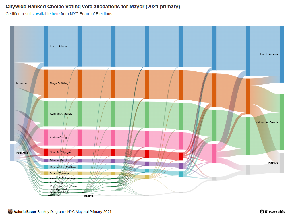
As the count does progress, even if there’s less nail-biting over the eventual winner, you’ll want to check out the astonishingly great data visualization work of the NYC Election Atlas, brought to you by Steve Romalewski and the Center for Urban Research at the Graduate Center of CUNY. For the 2021 NYC race, they’ve got interactive maps and infographics (go to 2021 RCV results: screenshot below) showing which support came from where in which round.
More coming for 2025, and undoubtedly worth your while. (And puts the ostensibly “most detailed map of the NYC mayoral primary” to shame.)